
Timeframe:
2 week sprint
Role:
UX Researcher and Designer
Team Members:
Rachel Aka, Sandra Hamlin, Yen Nguyen
ABOUT
Truth Be Told (TBT) is a non-profit organization that provides transformational programs through self-discovery for women who are or have been incarcerated resulting in increased self-worth, accountability, and positive contributions to society.
DISCLAIMER: I do not work for Truth Be Told, and the views in this case study are strictly that of myself and my team. As a young designer, I acknowledge that my vision for this project may be, at times, reliant on assumptions of business goals. In a perfect world, we’d be working alongside the Truth Be Tolds’ team with direct access to these resources to guide my work. Until then, this case study is meant to be an exploratory learning experience for an organization I admire.
Attracting new volunteers
CHALLENGE
Truth Be Told is struggling to keep track of all its volunteers and participants. Outreach and long-term engagement have also been a challenge, as they are having trouble attracting staff that fulfills all the different roles needed. TBT would like to know more about how to retain and attract volunteers.
Create a platform that’s easy for new and existing community members to navigate
PROJECT GOAL
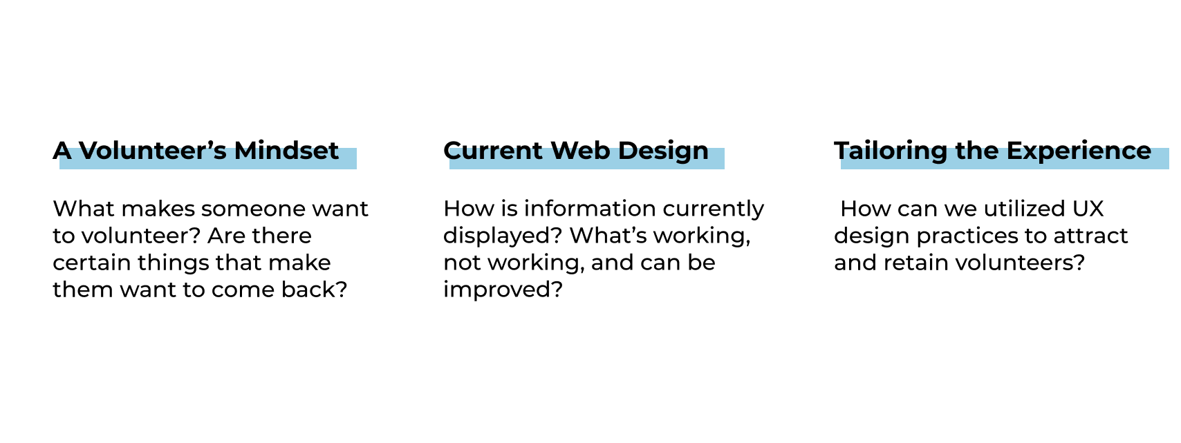
To achieve this goal, we paid attention to three main areas throughout this project: a volunteer’s mindset, current web design, and tailoring the experience.
Simple and clean navigation goes a long way
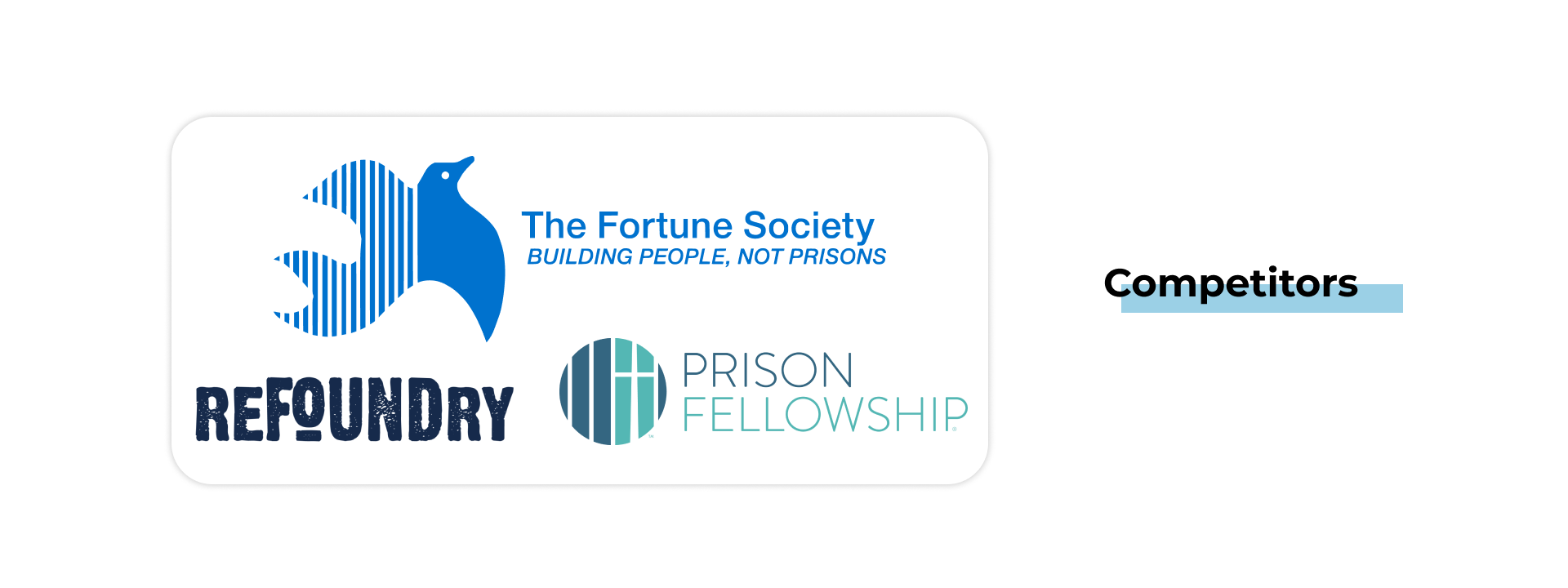
COMPETITIVE AND COMPARATIVE ANALYSIS
Since many non-profits rely on volunteers for the work they do, we decided to analyze three (3) comparator organizations and three (3) competitor organizations to see how they tackle a problem like this. From the perspective of a potential volunteer, we found that intuitive navigation made the process of learning about an organization, what’s expected of volunteers, and how to sign up more pleasant and enjoyable.

Lack of clarity and flow
INITIAL USABILITY TEST
When asking people to complete certain tasks on the existing website, it was safe to assume that the current flow of information created the most bottleneck for current and potential users. Information was “too much” yet “incomplete” at the same time and it was lacking a clear call to action path for users.


Good intentions can be hindered by vague or intimidating organizations
USER INTERVIEWS

Looking to dive deeper into a volunteer’s mindset, we decided to conduct user interviews to learn what people’s mindsets are toward volunteering, how they pick an organization, and why they do or don’t come back.


USER PERSONA
Grace needs a clear understanding of the organization and its expectations for its volunteers because she has limited time and wants to make sure she is a good fit for the role.
IDEATION SESSION
To ideate solutions for this problem, we asked our ideation session participants the following questions:
How might we help Grace learn about volunteer opportunities?
How might we help Grace gain clarity as to what specific volunteer positions entail?
How might we help Grace feel more comfortable when volunteering with a new organization for the first time?


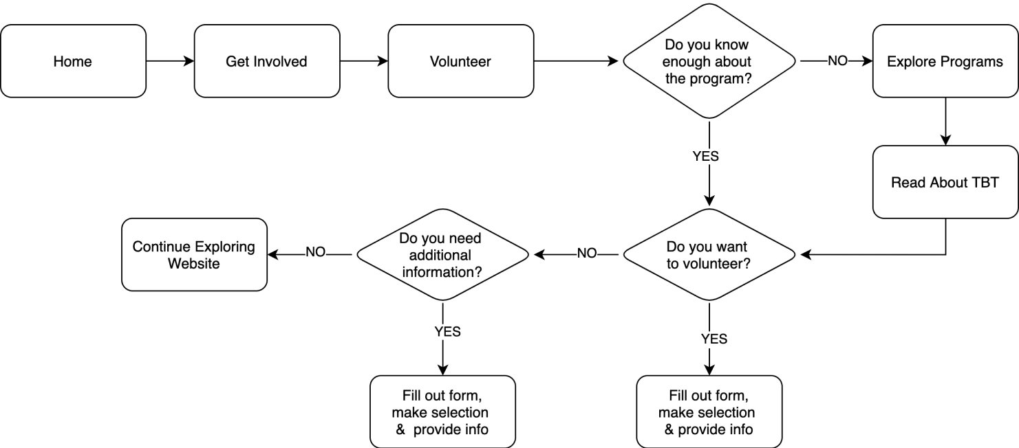
User flow and reorganization
DESIGN
Since our main challenge in redesigning TBT’s website is to attract and retain volunteers, it seemed fitting to focus on a user flow with the end goal of signing up to become a volunteer OR set up a meeting to get more information. We also updated the sitemap to better group information for easier navigation.

More work can still be done
USABILITY TESTING
After creating many iterations of our prototype, we began testing specific areas to see if we were successful in addressing the pain points we discovered during our research. To do so, we asked users to complete the following tasks:
Explore the home page of TBT’s redesigned website
Find the mission statement for TBT.
Navigate to view testimonials and media for TBT.
Find out more about how you can volunteer with TBT in a prison setting.
Please “fill out” the volunteer form and submit

FINAL PRODUCT
Iterations and next steps
Taking the feedback on what went well and what didn't into consideration, we continued iterating and improving our prototype. Our next steps, should we continue, would be to:

Continue refining the website's copy to be less overwhelming but still provide users with the necessary information.
Get in contact with current TBT participants, volunteers, etc. to get a more personal understanding of the organization.
Conduct research to determine if specific adjustments would need to be made for mobile and tablet users.