Timeframe:
Role:
Team Members:
10 Weeks
UX Designer and Prototyper
Haein Chung, Tiffany Do, Marissa Valenzuela, Nessa Vu
CHALLENGE
Wee Companions’ current website takes on the personality of a dated and dull nonprofit organization, but they are anything but that. There is a disconnect between their in-person and online identity/presence. They are looking to revamp their website to make it more attractive, easy to navigate, and synonymous with their brand identity.
A dated and dull website
PROJECT GOAL
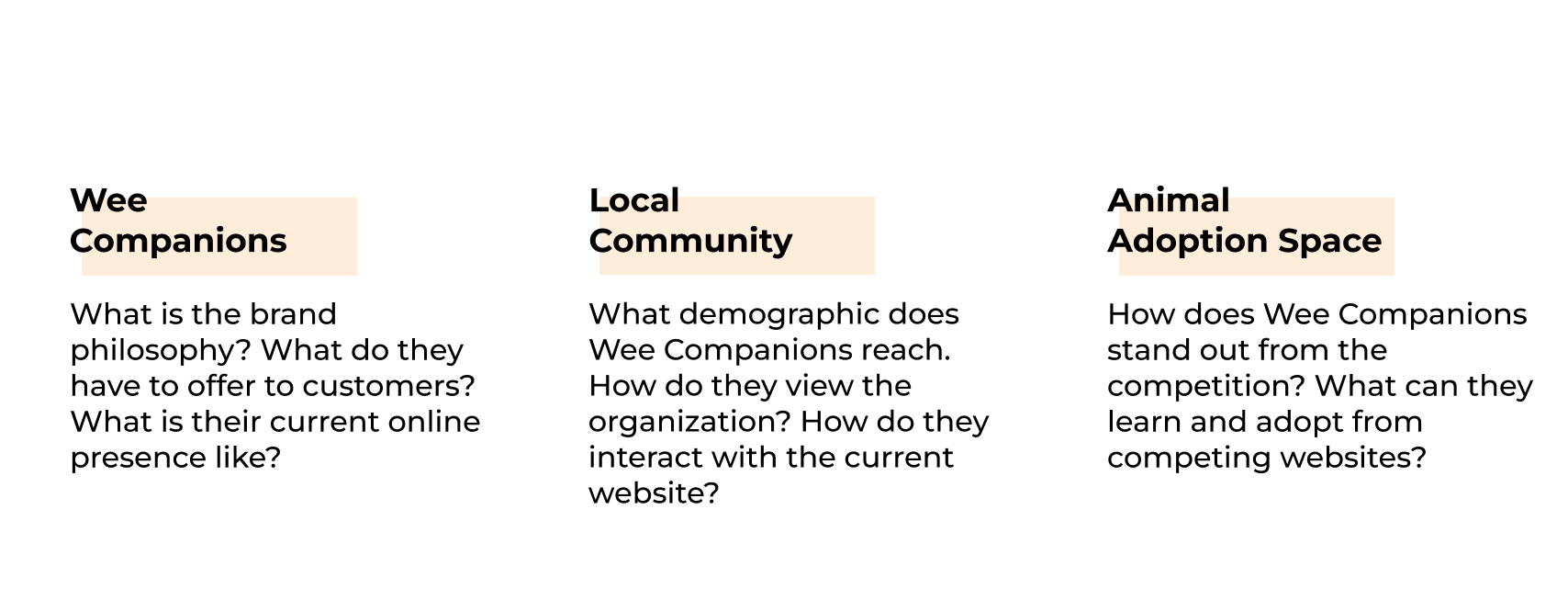
To achieve this goal, we paid attention to three main areas throughout this project: the organization itself, the community, and their presence in the animal adoption space.
Better represent Wee Companions’ brand and services in a digital space
ABOUT
Wee Companions is a rescue shelter dedicated to finding loving homes for its small animals. As opposed to traditional animal shelters, which focus primarily on larger animals such as cats and dogs, Wee Companions focuses on small furry exotics including, guinea pigs, rats, hamsters, mice and rabbits.
CLIENT INTERVIEW

USER INTERVIEWS
Looking to dive deeper into the community aspect of the organization, we went onsite and interviewed a total of 15 volunteers and community members during normal operational hours. The goal of these interviews was to learn customers’ initial impressions of the organization, what drew them to the organization, and what they would expect to find on Wee Companion’s website.
Many needs for many users
UX COMPETITIVE ANALYSIS
Because of the work that Wee Companions does, we decided to do a broad competitive analysis. Organizations chosen contain one or more of the following features: the ability to adopt/sponsor, donate, or purchase items/services. From this, we were able to draw inspiration for our own redesign that would best match Wee Companion’s brand and community presence.
Content, architecture, and functionality

Getting to know the organization
To kick off our research, we started by interviewing Wee Companions’ president, and our primary point of contact, Fenella Speece. The goal of the first half of the interview was to get a better understanding of the organization as a whole, while the second half consisted of analyzing their website. From this, we created the following preliminary priority list:


Highlight: sanctuary animals, Amazon wish list, events
Promote services: bondings, trimmings, cleanings
Renew branding: warm, welcoming, community-oriented
Improve usability, information architecture, and visual design
Inspire engagement: donations, volunteering
Encourage recurring visits to the website
Simplify the website maintenance for busy volunteers
USER PERSONA

USE CASE SCENARIOS
To further conceptualize all the data we’ve gathered for each persona, we created two (2) scenarios, each with five (5) use cases. Doing so allowed our team to see the overlap of informational needs and features between each persona and Wee Companions
Adapting for different scenarios
DESIGN
Customers and volunteers alike had strong feelings about Wee Companions in interviews, frequently describing them as a familial presence available beyond the adoption, throughout the lifetime of their pet. Our goal with the website is to impart this same understanding of Wee Companions as well.
Familial and friendly, yet knowledgeable and reliable — this is the impression we’d like our target audiences to leave the site with.
Conveying compassionate ideals and warm-hearted services


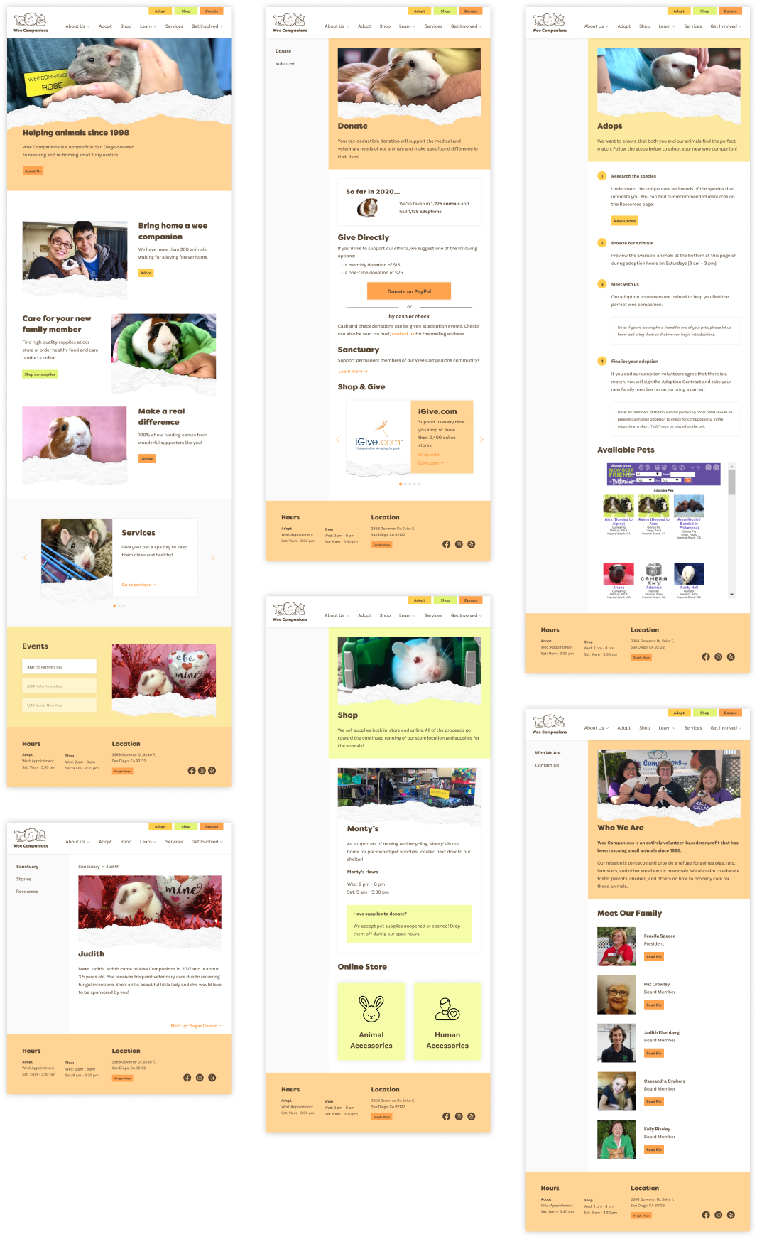
Since a majority of these features exist on the current website, our team concluded that our redesign would contain 8 revamped pages and 2 completely new pages (services and stories).
USER TESTING
During our initial testing phase, we created 7 tasks/scenarios for users to complete, each targeting major flows for the website. Some of these tasks include adopting a pet, finding information on the services Wee Companions offers, donating to the organization, etc.
A (relatively) intuitive flow

Overall, results from the user tests indicated that the major flow of the website from page to page was straightforward and easy to navigate. However, there was some confusion over whether certain text was expandable or clickable. Another issue was that the menu icon was not immediately apparent, but the homepage provided a lot of useful information and links to navigate the site without using the menu.
FINAL DESIGN
After making the necessary changes to our design and creating a high-fidelity prototype, we presented our final product and deliverables to Wee Companion. Although there was much interest and excitement in pursuing our concept redesign, plans were ultimately put to a halt due to increasing concerns regarding COVID-19 at the time.
A mobile website for new and existing community members

NEXT STEPS
Many months after the initial completion of this project, I decided to revisit our work to see how our mobile-first design could be adapted for desktops and larger screens. Moving forward, I hope to regain contact with Wee Companions and see if there is still interest in pursuing this update for their website and online presence.